
How to choose a font for your brand, logo or business
Whether you’re designing a logo, creating fliers for an event, or creating an infographic to post on your website, typography plays an important role. If you’re trying to achieve a professional look for what you make, your usage of typography can make or break that goal more easily than anything else. Here I’ll go over all of what you need to know when picking the perfect fonts for your project, as well as provide a few recommendations of fonts that I know work well together.
Use high quality fonts
First things first, you want to make sure that the fonts you’re working with are of a professional quality. This is especially important when working with more decorative fonts and when you’re planning on using the same visual style across several pieces. Lower quality fonts will often lack special characters such as ampersands (&) and diacritics (Ñ) which really limits their versatility in the long run. Additionally the default kerning (the spacing between letters) can be really inconsistent with lower quality fonts. Kerning is manually adjustable most of the time, but I’ll get into the nitty gritty of it later in this article.
How to find high quality fonts?
There’s a lot of websites out there that are filled with lower quality fonts such as 1001freefonts.com, DaFont.com and Fontspace.com. While these websites have no shortage of good quality fonts, it can be difficult to determine which fonts hold up well outside of the preview that’s given. If you want to avoid that issue altogether, I would highly recommend Google Fonts (fonts.google.com.) It’s completely free, all the fonts there are available for commercial use, and the fonts provided there are of a consistently high quality.
Another great option is adobe fonts (fonts.adobe.com) which also has consistently great quality. Unfortunately, adobe fonts is not a free service, but it comes with a subscription to adobe creative cloud, so if you’re working with adobe software, it may simply appear as available on your machine, or you can go and download them from adobe’s website.
If google and adobe don’t quite have what you’re looking for, then some of the aforementioned sites like Dafont and Fontspace aren’t bad sources, but you’ll have to vet the quality of fonts yourself. There are a few things to look for in a font that usually reflects quality.
Here are a few things to look for
in a font
Diacritic

A diacritic is a mark above a letter such as an enye (Ñ), an aigu (É), as well as a variety of other marks. Many fonts on the aforementioned websites lack these and aren’t fully complete. If you ever need to translate what you’re writing into another language, these become exceptionally important, and even if you’re not, they’re a good indication that a font has had the necessary time put into it. Think of it as a general indication of quality.
Multiple font weights
Font weights are usually referred to with names such as light, roman, bold, and often numbers as well which gives a more specific metric regarding how thick the lines are. Fonts with a wide variety of weights provide a lot of flexibility in their usage and make creating a visual hierarchy with your typography much easier. Some really nice quality modern fonts have variable weight versions that simply use a slider to determine how thick the lines are.
Wide and Condensed versions
The principle here is more or less the same as the point I made about font weights. Fonts that have a variety of weights and widths don’t just provide flexibility of use. These sorts of features are generally indicative of quality in other areas as well.
Different types of fonts
Now that you know how to find one good font now we can get to picking fonts to match. Before we get that however I feel the need to cover a few different types of fonts and how they relate to each other
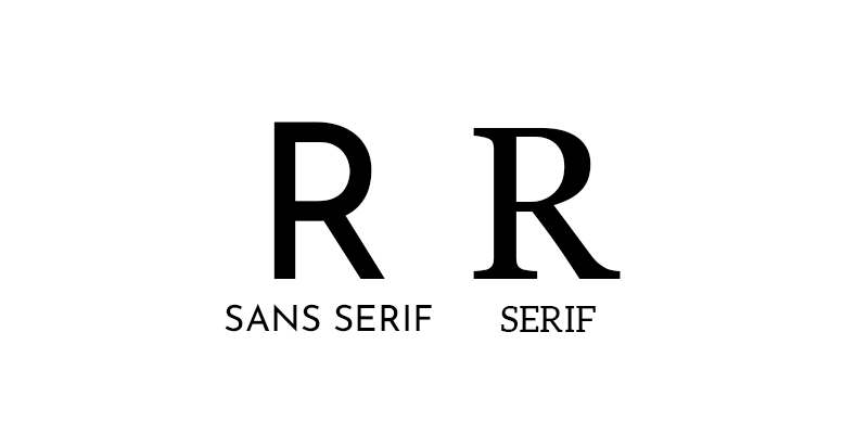
Serif
A serif is the decorative fine line at the end of strokes. Serif fonts are more commonly used for body text as opposed to headers. A common example of a serif font would be Times New Roman
Sans-Serif
Pretty self explanatory, it’s a font without serifs. Sans serif fonts are often used for headings and titles, and a some common examples of sans-serif fonts would be Arial and Helvetica
Monospace
In monospaced typefaces, every character has the same width. even narrower characters such as I and lowercase L will have the same amount of space dedicated to them. These sorts of fonts are typically used for spreadsheets or coding, but aren’t practical for use in design. Unless you’re specifically going for a typewriter or coding aesthetic, I’d recommend avoiding monospace fonts all together
Display
Display typefaces are a bit harder to categorize since it’s a broader category that any of the other typefaces can fit into. Display typefaces are designed for viewing at a very large scale and are often (but not always) more decorative. These are great for headers and titles, but I’d avoid using them for body text, even serif display fonts as sometimes the thinner lines will appear too thin at a small scale. Most serif display typefaces should have a not display variation that you can use if body text is what you’re looking for.
Handwriting
This one is also self explanatory. Handwritten looking typefaces can be good for childlike headers, or very fancy calligraphic headers. While the use case for these sorts of fonts is a lot more specific, there’s still a place for them. That said, under almost no circumstance should you use handwriting typefaces for body text. When you have a large block of text, serifs can help guide the eye and help make the text easy to read. The rougher look of hand written letters serves to do the opposite, and can make reading blocks of text a greater challenge than it would otherwise be.
Pairing fonts
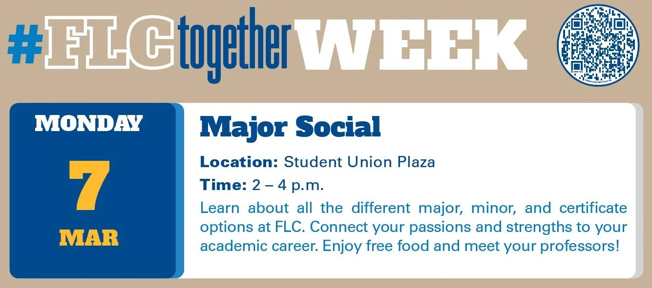
Now that you know how to find one good font now we can get to picking fonts to match. It’s common practice to use a separate font for your headers and text blocks. This helps differentiate the visual hierarchy of a project. Typically, you would use a sans-serif font for your headers and then a serif font for your body text. This however isn’t a hard fast rule. Here’s an example of Fort Lewis College using a type of serif typeface known as “slab-serif” for their headings and sans serif for their body text.
You don’t generally don’t want to pair two sans-serif fonts together or two serif fonts together because you run the risk of them either looking too similar, or clashing visually. Generally, you want to find fonts that share a lot of similar traits. Major ones to look out are the following:
Font weight
Many sans serif typefaces have a consistent line thickness whereas serif ones often don’t. That said, matching the width of the thickest lines on each is a good approach. For example, try comparing an uppercase T in either font. Is the middle column of the T the same width?
Axis
This one is a little less obvious, but many serif fonts with variation in line thickness will have the thinnest parts on a tilted axis. If both of your fonts have this sort of variation, make sure that the axis is close to being the same.

x height
This is probably the most important factor in pairing fonts as it ensures that they have a similar feel regardless of other features. X height is the term used to refer to the height of lowercase letters in a typeface. This can actually vary drastically, so finding fonts with a similar x height is crucial to keeping your typography looking consistent across typefaces.
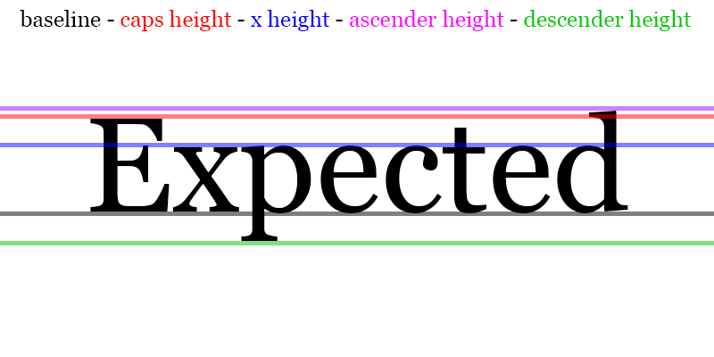
Descender and ascender height
Somewhat similar to x height is how high the tops of characters like lowercase b and l go, as well as how low characters like g and q go. Keeping this consistent across typefaces will really help keep your fonts grounded together.
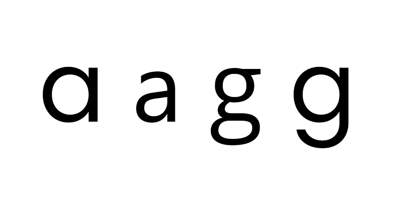
Letter forms
Certain letters are drawn in multiple ways. The most common examples are, a and g, though there are some other letters with form variants.
While it’s not crucial to keep these the same, and you often won’t be able to cross serif and sans serif, it is worth considering.
Font style/era
Even if your fonts lack unity in many of the aforementioned ways, sharing a common heritage can still make them feel cohesive. If you’re working with two separate fonts that scream 1960s, then that throughline can be enough to pull everything together visually.
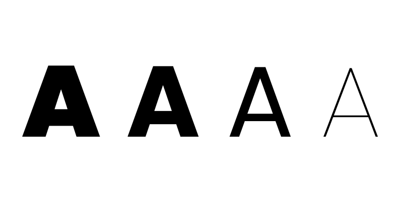
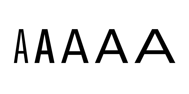
Kerning
Earlier I mentioned kerning, but I neglected to define it in depth. Essentially, kerning is the spacing between letters, and is manually adjustable in most design software. Kerning is more complex of a concept than it seems, because you can’t base it solely off of letter width.
For example:
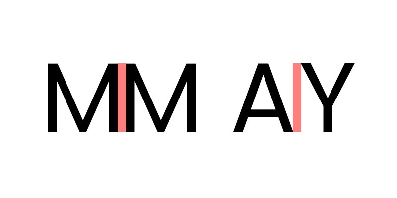
As you can see, the distance between the ends of the letters is the same, but the shape pairs make them feel totally off. Most high quality fonts take this into account, and are essentially pre-kerned, so you don’t have to worry about it. If you do find yourself working with a lower quality font, it’s necessary to kern the letters manually. In adobe software, you can kern type by holding down Alt+Left/Right Arrow (Windows) or Option+Left/Right Arrow (Mac OS) to decrease or increase the kerning between two characters. If you’re using something else, check online to see if kerning is a function that the software offers.
Summary
So let's go over what we learned. It’s important to choose high quality typefaces to avoid issues like poor kerning, lack of special characters and diacritics. Google offers lots of great quality typefaces for free, and adobe’s creative cloud subscription comes with all of their best fonts. If you end up looking for fonts elsewhere, it’s good to check to make sure they have a good variety of font weights and aren’t lacking any special characters or diacritics. You generally want to pair a serif and sans-serif font together (one for headers, and the other for body text) The two fonts you choose should share similar attributes, but most notably a similar x height.
Font pairs for you to try!
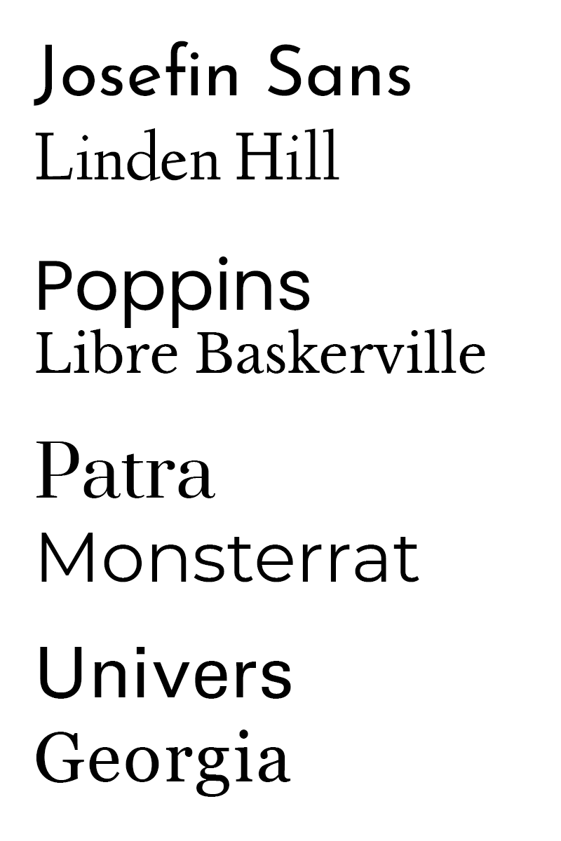
Here’s some fonts pairs that I would recommend based on the the guidelines I presented above.