How to create a color palette for your logo, brand or business
When it comes to developing a brand, having a distinct style is necessary to make everything advertised under that brand name cohesive. While having a certain logo and set of fonts can really help with this, nothing is more important than the color palette that you use. Colors can communicate a lot about the brand. A sleek black label with white text might make sense for classy alcohol packaging, but would look strange on a pack of cookies for a child’s birthday party. Oftentimes you have to operate within the assumptions of potential buyers and match what specifically they’re looking for. Now that’s not to say that you can’t differentiate yourself, but you need to understand what you’re communicating to consumers first.
Psychology of color
While it may seem insignificant, colors have associations that affect the manner in which people react. Below are some colors, their associations, and how they can be best employed in design.
Red
Red is a color with a lot of intensity behind it being often associated with rage, love, and importance. Psychologists have actually proven that large amounts of the color red have the ability to raise an individual's heart rate, blood pressure, and even metabolism which is why it a popular color in diners and fast food restaurants. Visit https://www.psychologistworld.com/perception/color to learn more. Red is great for instantly grabbing someone’s attention, and is great for action buttons on a website, or drawing attention to your packaging on a shelf.
Yellow
Yellow is associated with warmth, the sun and happiness. Since yellow is such a light color relative to most others, it can be used in tandem with darker colors like blue or black to catch the viewer’s attention. This is why many animals like snakes and bees use it to announce their dangerousness (or at least to blend in with the other potentially poisonous/venomous animals) and why we use yellow and black for hazard signs and crime scene tape.
Blue
Compared to the previous primary colors blue’s associations are far more somber, being associated with water, calm, and comfort. Aside from naturally having a cooler feel than the other two. If you want the viewer to be in a more strategic or relaxed mindset without the seriousness that black and white comes with, then blue is the way to go.
Purple
Purple historically has been associated with royalty due to the rarity of purple pigments. While purple is no longer a hard color to comeby, that association still exists, and gives off a sense of regality. Being a combination of both blue and red, it maintains much of the calm associated with blue while demanding attention in the same way that red does, though admittedly not to the same extent.
Green
Green is a fairly obvious one, being associated with plants, nature, and money. When paired with yellows and browns, it can give off a very earthy, natural feel. Be careful when paring green with red however as you run the risk of appearing christmassy, even when that’s not the intent.
Orange
Orange is a mix of red and yellow and reflects both the intensity of red, and the positivity of yellow to give a very playful, festive feeling to it. If your goal is to feel fun, then orange is a great choice, but isn’t often a good idea if you want to be taken seriously.
Black and White
Black and white are often paired together, but each have their own distinct feel depending which is used primarily. A strong black background with white text is often used for very serious looking brands. Many expensive fashion brands use this aesthetic as it lends itself to a sense of importance. When white is used primarily, it doesn’t say nearly as much since white is viewed as the default canvas color. That said, it has more recently become associated with technology and progress, with many tech companies (most notably Apple and Google) using primarily white tones with simple text, and many depictions of futuristic technology also reflecting this stark white look.
Color Combinations
In this section, I’ll cover popular types of color combinations that are designed to maintain a cohesive aesthetic. All of these are specified by where they sit next to each other on the color wheel
Monochromatic
The simplest option is monochromatic, which simply means picking a single color, and using a variety of shades as values. Pretty straight forward, but important to consider nevertheless.
Analogous
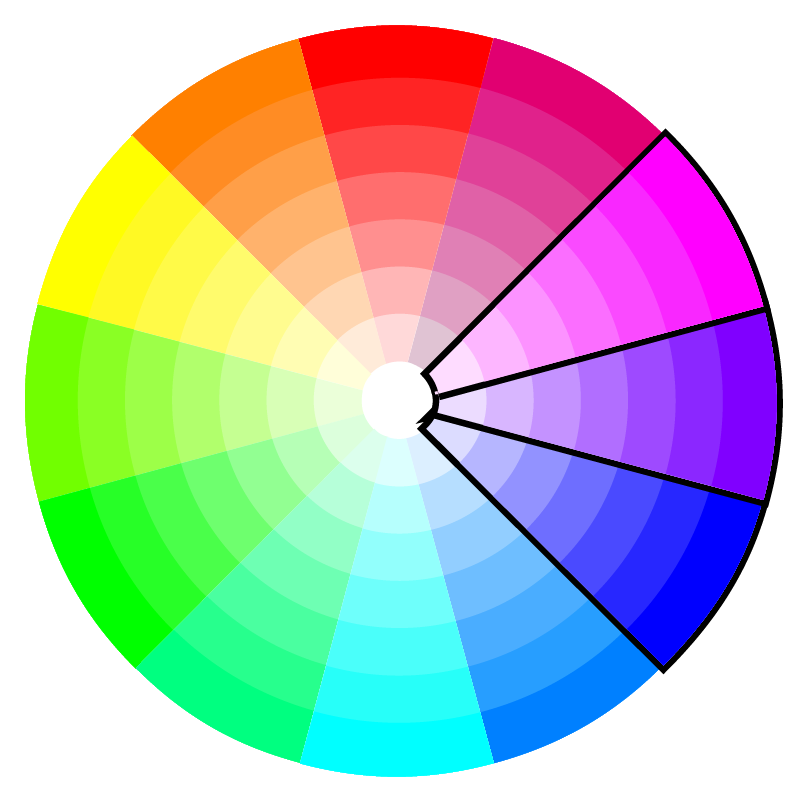
While similar to monochromatic, analogous colors provide a bit more variety. Analogous colors are hues that are adjacent to each other on the color wheel. This allows you to increase the value range (lightness and darkness) of your color selection without sacrificing the brightness of any given color (how saturated a color looks, not to be confused with how close a color is to white).
Complementary
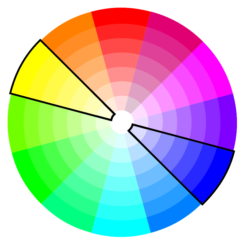
Complementary colors are hues on opposite sides of the color wheel. This is often very attention grabbing due to the stark contrast between the two hues. That said, do be careful, because you may run the risk of your colors being two loud or garish.
Split complementary
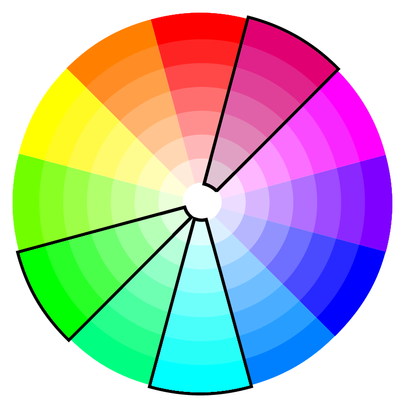
Split complementary is just like complementary except the complementary color is split into the two adjacent hues. Maintains the same bright, attention grabbing look of a complementary pair but with a bit more nuance. This can be great if you want to use red and green without looking so overtly christmassy.
Triadic
Similar to complementary but with an additional color. I find that this is great for bright, Pop Art like aesthetics, but it can also be used in a more calm, toned down way.
Here’s an example of a triadic color scheme in action.
Square
As the name implies, square color schemes form a square on the color wheel with two pairs of complementary colors, all four colors being equidistant from each other. The uses for this one are relatively limited, because working with so many broadly separated colors can be hard to employ together without looking childlike. This many bright colors can start to resemble children’s building blocks. Google however is a good example of how this can look in a more practical setting.
Tetradic
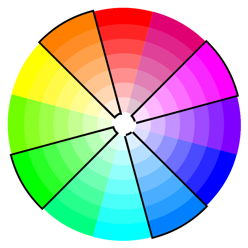
Tetradic color schemes form a rectangle on the color wheel. This is similar two both complementary and square color schemes but slightly more subtle and toned down than both.
Generally, I think limiting your color palette more is a good idea, but there are cases when expanding out into four or more colors is appropriate. Even then however, it is good to have a few dominant colors.


